Customise your Power BI report in real time
This technique allows for a colour to be picked by the user on the fly which then updates dynamically the report theme
Download demo at the bottom.

By FLAVIO MENESES ★ 6 min read
08 Nov 2022
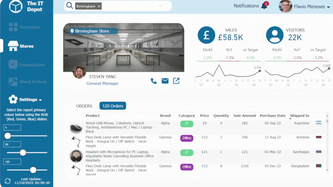
This article explains how to build a Power BI report that users can customise in real time.
This technique allows a primary colour to be dynamically changed which then updates all report with variations of that colour (e.g. lighter, darker, more saturated, etc.)
Defining the primary colour
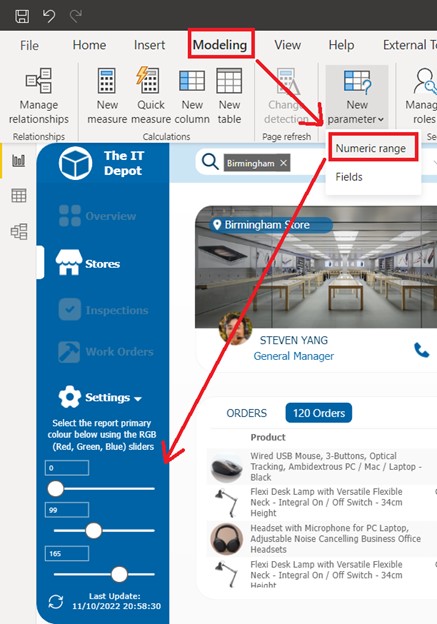
The first step is to get the primary colour that will drive all others.
To do this, we add 3 “Numeric Range” parameters to the page, with whole numbers ranging from 0 to 255 and increment of 1.
Then, we simply need to capture the user selections into a measure; in this measure, we’ll convert the inputs into an RGB colour than we’ll use for conditional formatting throughout the report.
RGB is one of the most well-known colour systems in the world. It combines Red, Green, and Blue light to create the colours we see on our TV screens, computer monitors, and smartphones. Each colour has a number from 0 to 255, meaning that 16,777,216 different colours can be generated.
As Power BI handles RGB natively, the measure can be simply written as follows, where the variables point to the selected value of the 3 Numeric Ranges.
UI - Primary Colour =

VAR _r = [Parameter - Colour Picker R]

VAR _g = [Parameter - Colour Picker G]

VAR _b = [Parameter - Colour Picker B]

RETURN

    "RGB(" & _r & "," & _g & "," & _b & ")"
Using a native Power BI shape, for example a rectangle for the left menu, we can use our new measure as a dynamic fill colour.
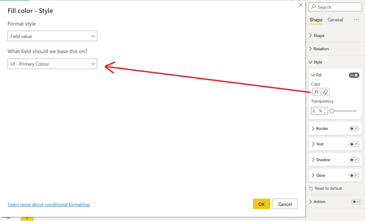
Every time the user interacts with the Numeric Ranges, this will be recalculated and the new colour rendered.
Darker & Lighter colours
Using the same primary colour, we can create darker and lighter variants to use in different report elements, for example the report header, icons or chart titles.
To create a darker colour, we multiply the selected red, green and blue values by a factor f, that can be any number between 0 and 1; the smaller this factor is the darker the colour will be. The calculation needs to be rounded as RGB only accepts whole numbers.
UI - Primary Colour Darker =

VAR f = 0.6 //the smaller this factor the darker the colour will be

VAR _r = ROUNDUP ( [Parameter - Colour Picker R] * f, 0 )

VAR _g = ROUNDUP ( [Parameter - Colour Picker G] * f, 0 )

VAR _b = ROUNDUP ( [Parameter - Colour Picker B] * f, 0 )

RETURN

    "RGB(" & _r & "," & _g & "," & _b & ")"
Likewise, to create a lighter colour, factor f should be greater than 1; the larger this factor is the lighter the colour will be. In this case, the result needs to be rounded as well as capped at 255, as is that the valid range for RGB.
UI - Primary Colour Lighter =

var f = 1.25 //the larger this factor the lighter the colour will be

var _r = MIN(

    ROUNDUP([Parameter - Colour Picker R] * f, 0),

    255)

var _g = MIN(

    ROUNDUP([Parameter - Colour Picker G] * f, 0),

    255)

var _b = MIN(

    ROUNDUP([Parameter - Colour Picker B] * f, 0),

    255)

RETURN

    "RGB("& _r &","& _g &","& _b &")"
Saturation
Another interesting scenario, is to change the saturation of the primary colour, for example to fade the primary colour and use in inactive buttons on the menu.
To do this, another colour system makes our lives easy: HSL.
The Hue, Saturation, Lightness system was developed as a way to evolve the RGB colour system by making it easier to visualize. The Hue determines what colour of the rainbow something is and is represented in 360 degrees, like a traditional colour wheel. The Saturation is the distance from the middle of the colour wheel towards the edge, where colours becomes brighter and more vivid. Finally, the Lightness of a colour is a gradient between black and white.
As our primary colour is in the RGB system we needed to convert it to HSL. To do this, we use the measure below. Despite long, it only requires the selected R, G and B values as inputs; the output is that same colour in degrees (the hue), which is a number between 0 and 360.
Convert RGB to Hue =

VAR selectedR = [Parameter - Colour Picker R]

VAR selectedG = [Parameter - Colour Picker G]

VAR selectedB = [Parameter - Colour Picker B]


// convert rgb values to range between 0-1

VAR convertR = selectedR / 255

VAR convertG = selectedG / 255

VAR convertB = selectedB / 255


// find min and max values out of r,g,b components

VAR maxRGB = MAX ( convertR, MAX ( convertG, convertB ) )

VAR minRGB = MIN ( convertR, MIN ( convertG, convertB ) ) // calculate hue


VAR hueCalc =

    SWITCH (

        TRUE (),

        maxRGB - minRGB = 0, 0, // all greyscale colors have hue of 0deg

        maxRGB = convertR, ( convertG - convertB ) / ( maxRGB - minRGB ), // if red is the predominent color

        maxRGB = convertG, 2 + ( convertB - convertR ) / ( maxRGB - minRGB ), // if green is the predominent color

        maxRGB = convertB, 4 + ( convertR - convertG ) / ( maxRGB - minRGB ) // if blue is the predominent color

    ) * 60 //convert to degrees, as hue is shown on hsl color wheel


// make sure hue is a positive angle on the color wheel between 0 and 360

VAR hue = IF ( hueCalc < 0, hueCalc + 360, hueCalc )


RETURN

    ROUND ( hue, 0 )
With this, the final colour is simply written as follows, where saturation and lightness have both been set at 45%.
UI - Colours - Inactive Icons = "HSL("& [Convert RGB to Hue] &", 45%, 45%)" Changing Icon colours
To make icons change colour dynamically as well, we can pass any of the colours described above as part of an SVG image.
Scalable Vector Graphics (SVG) is an XML-based vector image format that supports interactivity and animation. SVG images can be scaled in size without loss of quality and are rendered by the most-used web browsers.
Source: https://en.wikipedia.org/wiki/Scalable_Vector_Graphics
To get SVG images you can use open source tools like Iconify. For example, the search for “user” returns the following results:
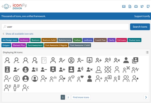
When an icon is selected, we can click the “SVG” option and this displays the code that is needed to render that icon.
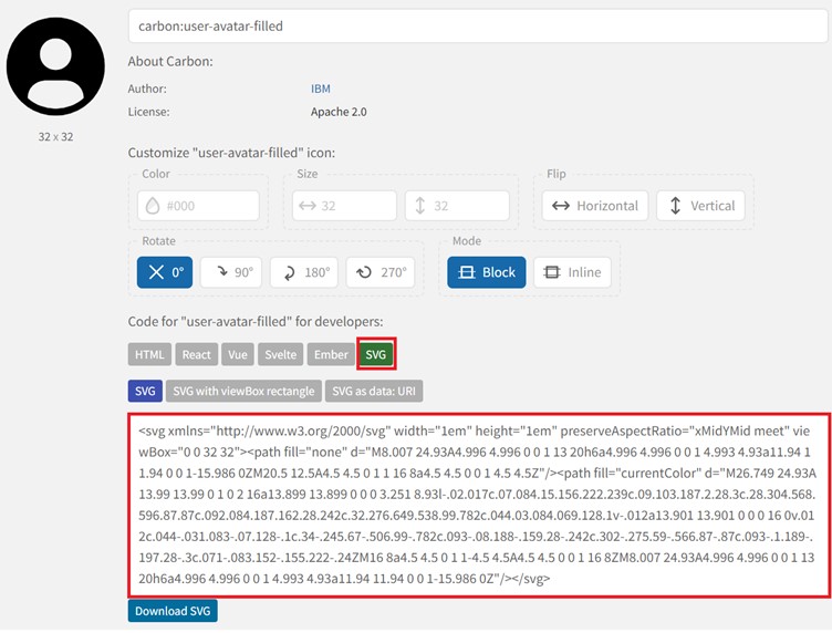
With this code, we can create a new measure in Power BI and pass the dynamic colour as the “fill” parameter.
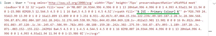
A few notes: you’ll need to start and end the measure with double quotation marks “ ” and replace any quotation marks on the SVG code with single quotation marks ‘ ‘ which can be easily done in any text editor, for example Notepad. You might also need to adjust the “width”, “height” and “viewBox” parameters to achieve the dimensions you’re looking for.
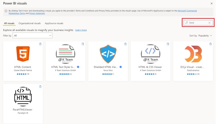
Finally, you’ll need a custom visual capable of rendering HTML to display the icon. A search on the Microsoft AppSource reveals a number of viable options.
Considerations
A couple of caveats should be mentioned.
Care should be taken to avoid overloading the report with too many or unnecessary visual elements as that will affect performance negatively.
Overlapping colours, as we’ve done with the icons over the left menu, can cause some colour combinations to be hard to distinguish. A refinement of this technique could be to calculate contrast and display a colour variation with better contrast.
Other use cases
This technique could also be used, for example, to switch a report to dark mode; whilst in theory this could already be achieved with bookmarks, bookmarks would require considerable effort to set up, show/hide and maintain.
Another idea could be to display other principles of colour theory, for example, complementary, analogous or triadic colours from a single selection. Another option would be, of course, to let the user select multiple colours but please bear in mind the potential negative performance implications mentioned above.
Wow, Love your tutorials. Thanks for sharing.
Glad that was useful!
Thanks for sharing the solution
Hi Mahesh, you’re welcome!