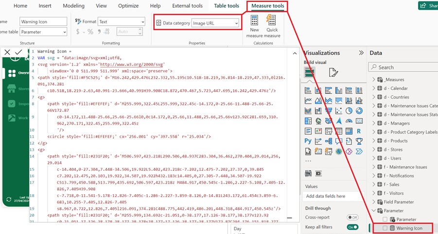
Building Alerts for Excessive Data in a Power BI Matrix

Show a custom warning when the matrix truncates the number of columns

Download demo at the bottom.

By FLAVIO MENESES ★ 5 min read

29 Apr 2024

Custom Alerts for Excessive Data in a Power BI Matrix

The problem

A Power BI matrix can show up to 100 columns – the documentation doesn’t mention it, but that includes totals and sub-totals columns.

If you try to show more than this, columns over that limit will be truncated and an icon will indicate not all data can be displayed.

Information icon: too many values. Not showing all data

The issue is this icon is very subtle and many users miss it, especially casual users – it only shows if you hover over the visual which, from experience, is easy to overlook. The icon’s behaviour can also be misleading – if you’re so unlucky as to have precisely 100 columns of data, the totals will be truncated but no warning will tell you this.

From an end user’s perspective, this presents a problem as it can lead to misinterpretation of data. They might ask, “why are sales stopping in April when I have a full year of data”? Or “surely the total sales in the matrix don’t add up to the £5.32m sales shown in the card” – they’d have a valid point in both cases.

Is my data right?

Showing a clear warning

To avoid these questions and frustration, you can show an obvious warning message on the page, that can’t be ignored, every time the user tries to display too much information for the matrix.

To come up with such a message, we need to know how many columns are on display in the matrix at any given time.

A complexity, however, is that Power BI matrices usually show date hierarchies across the columns (e.g. years, months, days), so we also need to know what level of the hierarchy is on display.

Figuring out the current level of the hierarchy can easily be done with the DAX function ISINSCOPE, however in this case that won’t help as the warning needs to live outside the matrix so ISINSCOPE won’t know what’s being done inside the matrix.

We need therefore an element that allows users to interact with (to select the hierarchy) and that we can monitor outside the matrix (to count the number of columns). These requirements can be achieved instead with a Field Parameter.

Creating the Field Parameter

At the time of writing, Field Parameters are still a preview feature, which needs to be enabled if you haven’t already.

The Field Parameter can easily be created as shown below; for this demo, I’ll include month and day columns from my Calendar dimension table, which will be the matrix hierarchy levels.

Creating the Field Parameter
Field Parameter fields

Using the new Slicer visual, (also a preview feature that needs to be enabled) we can then create a selector to allow the user to pick between months, days or both. For best results, the following settings are recommended for the Slicer.

Recommended Slicer settings

Creating the DAX Measures

To monitor user selections and show the warning when they’re trying to display too much data for the matrix, we’ll need the follow measures.

Warning Message =

VAR countMonths = COUNTROWS ( VALUES ( ‘d – Calendar'[Start of Month] ) )

VAR countDays = COUNTROWS ( VALUES ( ‘d – Calendar'[Day] ) )

VAR selectedTimeframe = SELECTEDVALUE ( ‘Field Parameter'[Field Parameter Fields], “Both levels selected” )

VAR warningMessage = ⚠️ Attention! Columns shown might have been truncated. Please select only months or apply a filter to reduce the timeframe displayed”

RETURN

    SWITCH (

        selectedTimeframe,

        NAMEOF ( ‘d – Calendar'[Start of Month] ), IF ( countMonths > 99, warningMessage, BLANK () ),

        NAMEOF ( ‘d – Calendar'[Day] ), IF ( countDays > 99, warningMessage, BLANK () ),

        “Both levels selected”, IF ( countMonths > 99 || countDays > 99, warningMessage, BLANK () ),

        BLANK()


    )

This measure, counts the number of possible months or days to be displayed, and will respect any filters the user might have applied to the report; it also monitors the hierarchy level the user has selected for the matrix (months, days or both). Finally, it will show the warning if the user is trying to display more than 99 columns – this is because I’ve allowed for a totals column which will be the 100th column and maximum the matrix currently supports.

Warning Icon =

VAR svg = “data:image/svg+xml;utf8,

<svg version=’1.2′
xmlns=’http://www.w3.org/2000/svg’

     viewBox=’0 0
511.999 511.999′ xml:space=’preserve’>

<path style=’fill:#F5C525;’ d=’M16.242,429.476L232.332,55.195c10.518-18.219,36.814-18.219,47.333,0l216.091,374.281

   
c10.518,18.219-2.63,40.991-23.666,40.991H39.908C18.872,470.467,5.723,447.695,16.242,429.476z’/>

<g>

    <path
style=’fill:#EFEFEF;’
d=’M255.999,322.45L255.999,322.45c-14.172,0-25.66-11.488-25.66-25.66V172.87

       
c0-14.172,11.488-25.66,25.66-25.66l0,0c14.172,0,25.66,11.488,25.66,25.66v123.92C281.659,310.962,270.171,322.45,255.999,322.45z

       
‘/>

    <circle
style=’fill:#EFEFEF;’ cx=’256.001′ cy=’397.558′ r=’25.034’/>

</g>

<g>

    <path
style=’fill:#231F20;’
d=’M506.597,423.218L290.506,48.937C283.304,36.462,270.404,29.014,256,29.014

        c-14.404,0-27.304,7.448-34.506,19.922L5.402,423.218c-7.202,12.475-7.202,27.37,0,39.845

       
c7.202,12.475,20.103,19.922,34.507,19.922h432.183c14.405,0,27.305-7.448,34.507-19.922

        C513.799,450.588,513.799,435.692,506.597,423.218z
M484.917,450.545c-1.286,2.227-5.108,7.405-12.826,7.405H39.908

       
c-7.718,0-11.541-5.178-12.826-7.405c-1.286-2.227-3.859-8.126,0-14.81L243.172,61.454c3.859-6.683,10.255-7.405,12.826-7.405

       
s8.967,0.722,12.826,7.405l216.091,374.281C488.775,442.419,486.201,448.318,484.917,450.545z’/>

    <path style=’fill:#231F20;’
d=’M255.999,134.692c-21.051,0-38.177,17.126-38.177,38.177v123.92

        c0,21.051,17.126,38.178,38.177,38.178s38.177-17.126,38.177-38.177V172.87C294.176,151.818,277.05,134.692,255.999,134.692z

         M269.142,296.79c0,7.247-5.896,13.143-13.143,13.143s-13.143-5.896-13.143-13.143V172.87c0-7.247,5.896-13.143,13.143-13.143

        s13.143,5.896,13.143,13.143V296.79z’/>

    <path
style=’fill:#231F20;’
d=’M255.999,360.002c-20.706,0-37.552,16.846-37.552,37.552c0,20.706,16.846,37.552,37.552,37.552

        s37.552-16.846,37.552-37.552C293.55,376.848,276.705,360.002,255.999,360.002z
M255.999,410.071

        c-6.902,0-12.517-5.615-12.517-12.517c0-6.902,5.615-12.517,12.517-12.517s12.517,5.615,12.517,12.517

       
C268.516,404.455,262.901,410.071,255.999,410.071z’/>

</g>

</svg>


RETURN


    IF ( NOT ISBLANK ( [Warning Message] ), svg )

This measure will dynamically plot the warning icon as an SVG element; for this to happen correctly, we also need to define the data category as “Image URL”, as shown below.

Define measure's data category

Creating the warning

Finally, we just need to show the warning!

The easiest way to do this, is to use the also new card visual – you know the drill, enable the preview!

Add a new card visual

To achieve the final result shown above we’ll need to finally assign the Warning Icon as an image to the card as follows:

Assign the warning icon as an image

And there you have it! This way users will be given a clear warning when data is being cut-off which should avoid phone calls and emails!  

You can download the demo .pbix below, which is based on my other article Customise your Power BI report in real time

Leave a Reply

Your email address will not be published. Required fields are marked *

Scroll to Top